


Header links are displayed as text and/or icons if your site has primary or secondary header links configured.
The Login icon is only displayed if your site has the Oxford-only content restriction enabled.
The search bar is displayed in every header style and its position in the main region is fixed.
Site title and subtitle will not display at all in style 2 even if they are added to the Site Details tab and set to display. Site title and subtitle will only display in styles 1 and 3-6 if the title and subtitle are set to display in the Site Details tab.
There are six desktop header styles available:
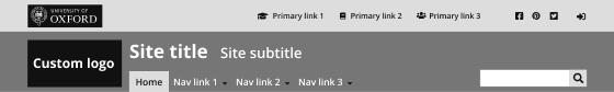
Style 1 (default for new sites)
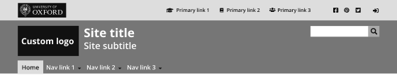
Features:
Rectangle Oxford crest in top bar ; Custom logo ; Site title and subtitle ; Menu under logo ; Sticky header not available
Style 2
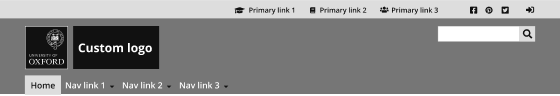
Features:
Square Oxford crest in main region ; Custom logo ; No site title and subtitle ; Menu under logo ; Sticky header not available
Style 3
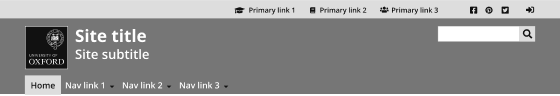
Features:
Square Oxford crest in main region ; No custom logo ; Site title and subtitle ; Menu under logo ; Sticky header not available
Style 4
Features:
No Oxford crest ; Custom logo ; Site title and subtitle ; Menu under logo ; Sticky header not available
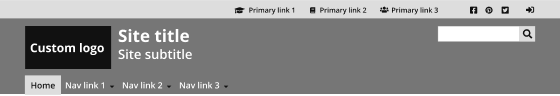
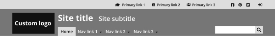
Style 5
Features:
Rectangle Oxford crest in top bar ; Custom logo ; Site title and subtitle ; Menu next to logo ; Sticky header available
Style 6
Features:
No Oxford crest ; Custom logo ; Site title and subtitle ; Menu under logo ; Sticky header available


