Carousel

User level: Site Owner; Site Administrator; Site Editor; Site Author

A side-scrolling set of items linking to other pages, which uses preset visual styles.

For details of what source content is available in listing widgets, see the Grid listing documentation.

The Carousel widget offers eight layout styles, and different configuration options are available depending on the selected style:

Layout style

Tertiary text field available

Call to action button

Tile. Without Rollover

-

X

Tile. With Rollover

-

X

Tile. Landscape - Square Image

X

-

Tile. Landscape – No Image

X

-

Tile 50:50

-

X

Card – No Image

-

X

Card – Icon Image

-

X

Card – Banner Image

-

X

If you select a layout which supports tertiary text, a new field will be shown below the main listing text box. Example: Select Tile. Landscape - Square Image:

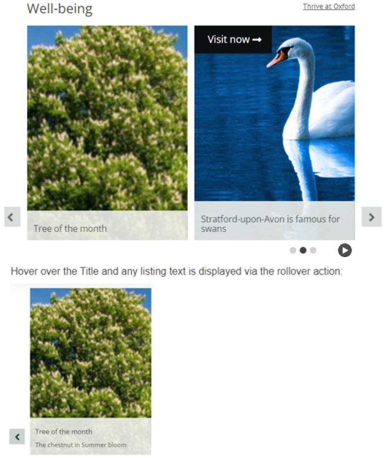
This is how text appears:

For details of how to configure font settings in listing widgets, see the Font management documentation.

Go to Site settings: colour management / Advanced mode to apply additional configuration:

Main regions: option to change Widget title colour.

Widgets: configure Listings, and expand Item Styles to configure Tile - Landscape, Tile - Portrait and Card styles.

Select text alignment options in Site Settings / Site Theme for Tile and Card item styles (used in Grid and Carousel widgets).

Refer to Images for documentation about image dimensions.

Visit the Pattern book for more examples.

Options

Expand All

It may be useful to add a title to the Carousel with the option of adding a link:

Add URL by clicking in URL field:

Remember to add title for the URL link. This provides the link text displayed above the Carousel. There is an option to open the link in a new window:

This is how it displays:


It is also possible to link from each tile (listing item) to another website:

For each listing item, scroll down and click in the Link field:

Click on the tile to visit the website:

For layouts which support a Call to action button:

Click Call to Action button, click in URL field and add external URL.

Add text to display as the Call to Action button.

Click Open in new window if that’s what you want the visitor to experience.

Example of how button displays:

Examples of Carousel layouts using static content source

Peeking = the set number of slides will be displayed as the carousel rotates. The beginning of the next slide and end of the last slide outside of the set number are shown as a visual tease.

Loop = the Carousel will continue to rotate through the sequence of images whether manually using the > or by pressing the Auto Play button.

Auto Play = a Play / Pause button is displayed and will cycle through the Carousel images automatically once the Play arrow is pressed.

Expand All

Shows tertiary text (note, no Call to action button)

Tile. Landscape - Square Image is intended to be concise, space-efficient, and useful when you want to be able to show many items at a time. It is intended to be used in Grid listings and Carousels and be used two, three, four or six per row.

The minimum height of the ‘Square image’ item style is 128px, as governed by the size of the image. The maximum height is governed by the size and quantity of text it contains.


Shows tertiary text (note no Call to action button)

Tile. Landscape - No Image is intended to be concise, space-efficient, and useful when you want to be able to show many items at a time. It is intended to be used in Grid listings and Carousels and be used two, three, four or six per row.

The minimum height of the ‘No image’ item style is 48px. The maximum height is governed by the size and quantity of text it contains.

More Carousel examples