Navigation

User level: Site Owner; Site Administrator


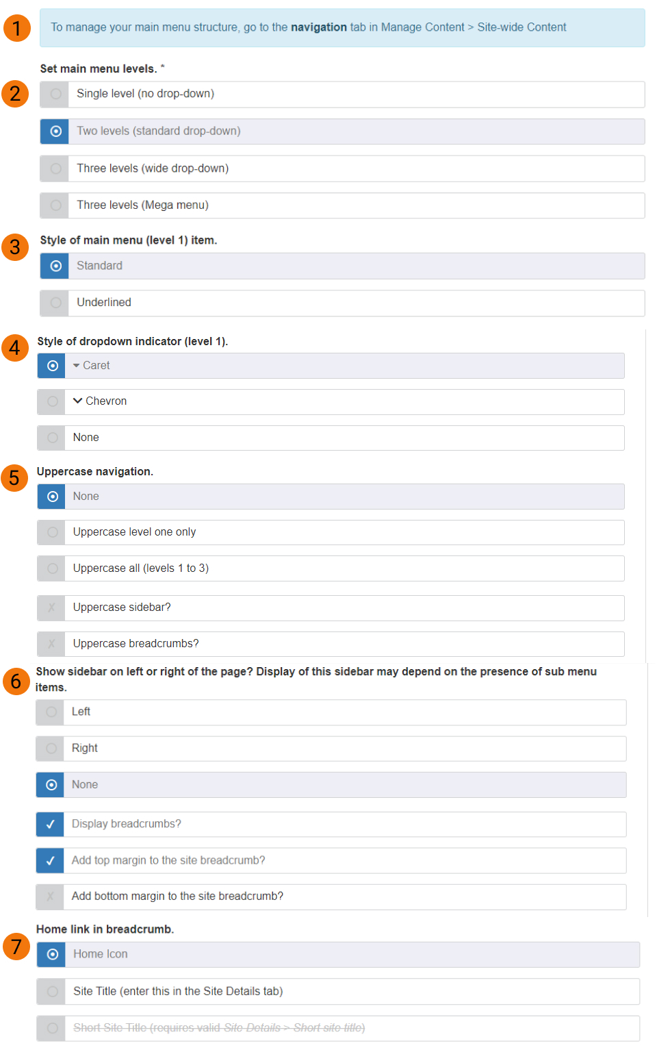
The Navigation tab in Site Settings allows you to manage the appearance of the navigation features of your site.

Screenshot of navigation tab in site settings

Expand All

The main menu appears in the Header and is the principal navigational aid on a website. There are two locations in the user interface (UI) where the main menu can be configured.

Manage Content > Site-wide content > Navigation tab > 'Main menu' 

The 'Main menu' button provides access to the Main menu configuration page. On this page, you can drag and drop page titles to where you want them to appear in the navigation structure. 

This option is recommended if multiple changes need to be made to the navigation structure at once.

For information about configuration options, such as how to add and remove links, refer to the main menu documentation.

Edit mode on a page > 'Menu settings' tab

The menu link to a page can be configured on the 'Menu settings' tab in the page's edit mode.

A new site is provisioned with 'Two levels' as the default. Setting the number of menu levels determines how the main menu in your site's header will behave.

Single level:

Only the top level menu items are displayed.

Menu level: Single

Output on a Mosaic site: Single level menu links


Two levels:

Top level and second-level menu items (in drop-down menus) are displayed.

Menu level: Two levels

Output on a Mosaic site: Two level menu links


Three levels:

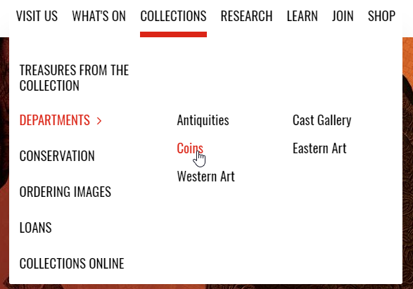
Second and third level menu items are displayed in a wide drop-down menu. 

Menu level: Three levels

Output on a Mosaic site: Three level menu links

Choose how top level menu links are styled.

Standard:

'Standard' style uses background colour and foreground colour changes to indicate hover/focus and active links.

Link style: Standard

Output on a Mosaic site: Standard menu link style


Underlined:

'Underlined' style adds a line below links.

Link style: Underlined

Output on a Mosaic site: Underlined menu link style. Note: capitalised text in the example is not determined by the link style.


Details of how to customise colour pairings can be found in the colour management documentation

Choose a dropdown arrow styling if you want to indicate the menu contains a second level of items.

New sites are provisioned with 'None' set as default. 

Guidance on using capitals is provided in the University's general accessibility documentation.

The sidebar menu provides a menu of links to sub-pages, and can only be used on Page content types; it is not available for Article, Event, or Person content types.

Top-level page Second-level page Third-level page Appears in sidebar?
Landing page 1    
  Sub-page 1.1  
  Sub-page 1.2  
    Sub-page 1.2.1
   

Sub-page 1.2.2

  Sub-page 1.3  


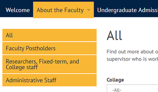
In the screenshot below, the pages listed in the sidebar menu in bright orange (e.g. 'News and Events'; 'People'; and 'Recent Publications') are direct sub-pages of the 'About the Faculty' page (second-level). The pages listed in pale orange are sub-pages of the 'People' page (third-level).

Sidebar menu

Output on a Mosaic site: Sidebar menu

Sidebar context

Because the sidebar displays links to pages at the same level or lower in the page hierarchy, it will contain different links depending on where in the hierarchy it is viewed. Using the example in the table above, the table below illustrates how the sidebar appearance changes depending on its viewing context:

Viewed on top-level page Viewed on second-level page Viewed on third-level page
  • Sub-page 1.1
  • Sub-page 1.2
  • Sub-page 1.2.1 (collapsed)
  • Sub-page 1.2.2 (collapsed)
  • Sub-page 1.3
  • Sub-page 1.1
  • Sub-page 1.2
  • Sub-page 1.2.1 (collapsed)
  • Sub-page 1.2.2 (collapsed)
  • Sub-page 1.3
  • Sub-page 1.2.1
  • Sub-page 1.2.2


Sidebar menu on a sub-page

Output on a Mosaic site: Sidebar menu on a third-level page

Sidebar positioning

Use the controls (6) on the Navigation tab to position the sidebar on the left or right of the page, or to prevent it from appearing on the site at all.

To hide sub-navigation on certain pages only:

  • select a position (left/right) (6) on the Navigation tab
  • in the edit mode of the page the sidebar is not to be displayed on, go to the Details screen
  • at the bottom of the Details screen check the 'Hide sidebar menu?' box
Hide sidebar checkbox in page edit-setup

Page edit mode > Setup screen > Hide sidebar checkbox


When the sidebar is displayed, it is not positioned within any of the page regions in the way a widget is. Instead, it sits outside of the page regions and displaces them either to the left or right, depending on where it is positioned.

Breadcrumbs can be set to display or not display on pages. If breadcrumbs are enabled, they appear on every page on the site, and are positioned at the top of the main content area, above the page title.

Breadcrumbs

Output on a Mosaic site: Breadcrumbs displayed above the page title

The pages listed in the breadcrumb are determined by the navigation structure, which can be configured in the Main menu screen, or the page edit mode.

Breadcrumb font size

The font style used in the breadcrumb can be set using the advanced Font Management options.

Breadcrumb top and bottom margin

When the 'Display breadcrumbs?' checkbox is checked (Site Settings > Navigation tab), two checkboxes are displayed to allow top and bottom margin, respectively, to be added to the breadcrumb.

When the 'Display breadcrumbs?' checkbox is checked, the 'Add top margin to site breadcrumb?' checkbox is checked by default.

We've provided screenshots of headers which use different navigation options in the Mosaic Pattern Book.